Paint Colour Inspiration [That Isn't Beige, White or Grey!]
I started writing this post in March 2020. Almost a whole year ago. It had been lingering in my drafts folder, and when I went to write this weeks blog post it jumped out at me as it feels more relevant than ever. Maybe it’s constant lockdowns and even more time looking at interiors, but I’m pretty bored of seeing the same kinds of colours used over and over again.
Don’t get me wrong, I’m a massive fan of whites and beiges and I wholeheartedly believe that paler greys are timeless classics. I will never tire of neutrals.
But what about other colours? Especially if you don’t want anything dark, bright or saturated? Sometimes it’s hard to know where to start, so I thought it would be nice to take a look at some under-rated options that have been getting under my skin recently (well, okay over the last year apparently). Not sure how many will end up in my house, but worryingly, when this happens, it usually signifies that a change is coming. Uh-oh…
Confession: since originally starting to write this post last March two of the below colours have indeed come into my house. You’ve seen peeks of one in my TV room (the full reveal really is coming soon), and you’re yet to see the other. I wonder if you can guess!
Blush Pink
I know, GROUNDBREAKING. But are we sick of pink yet? Well, it would seem not!

Farrow & Ball Pink Ground (Image: Bianca Hall)
Yes, pink has been done to death, some good, some not so good, but like it or not, it’s not going anywhere anytime soon. Over the past five or six years I’ve had a pink living and dining room, a pink bedroom (very briefly, as I definitely got the tone wrong!) and I still have a pink front door. Oh and a pink colour blocked square on the dining room wall too, to frame a grid of prints. Could blush pink be here to stay? Only time will tell, but I suspect that the paler, more muted pinks may just be in for the long haul.

Sanderson Rose Ash Light (Image Bianca Hall)
Check out…
Temple - Paint & Paper Library
Mellow Yellow
Now this is an odd one for me as I’m not a massive yellow fan these days. Well actually I do like a spot of acid yellow, especially when juxtaposed against pale neutrals, and that’s about it, or so I thought. But lately I’m really drawn to muted pale ochre tones and softer buttery shades. I know, who even am I? It worries me. ‘Worries’ as in I already have a painting list a mile long that I really want to conquer and I don’t want to jump my self-imposed painting queue on a whim with another project. However, even as I type, I wonder if this could be my next front door colour. Oh dear.

Farrow & Ball Hay (Image: Farrow & Ball)
Check out…
Camilla’s Cream - Ca Pietra Good Proper Paint
Moody Blues
I’m not really a blue person. Am I? Or could it be that I just hadn’t met the right blue? Who knows. But what I do know, is that for a while now, some blues have been calling me.
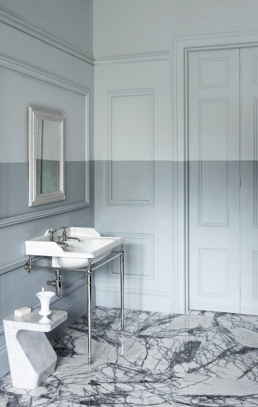
Paint & Paper Library Porcelain II and V (Image: Paul Raeside for Paint & Paper Library)
I’m not talking about dark blues - been there, done that a decade ago with Hick’s Blue in my living room. I’m talking about more classic powdery and muted mid-toned blues. For a while last year, I thought about painting the living and dining rooms blue, but I never quite committed to the idea, but never say never!
Check out…
Porcelain - Paint & Paper Library
Zale’s Powder - Ca Pietra Good Proper Paint
I’m not going to delve into green suggestions today. I haven’t really got any. I know dark greens in particular are absolutely everywhere at the moment but I find them really oppressive, and I’m pretty bored of them already #sorrynotsorry. For me they’re in the same box as Down Pipe. That’s the ‘I’d be happy to never see them again’ box if that’s in any way unclear. I know I lot of people LOVE them (Devol has a LOT to answer for!), they’re just not for me. Maybe it’s because I’m still not over the trauma of the dark green kitchen units that we inherited when we bought this house that I couldn’t paint over fast enough.
However, with the imminent launch of the California inspired capsule collection by Kelly Wearstler for Farrow & Ball, which includes the super zingy ‘Palm’ green, I can’t help but think that fresher more minty hues might start seeing a bit more action over the next year. I feel like this collection signals an exciting change in direction for colour in interiors and I’m here for it. Faded Terracotta anyone? Yes please!

Kelly Wearstler x Farrow & Ball Palm (Image: Trevor Tondro)